
inspiration:
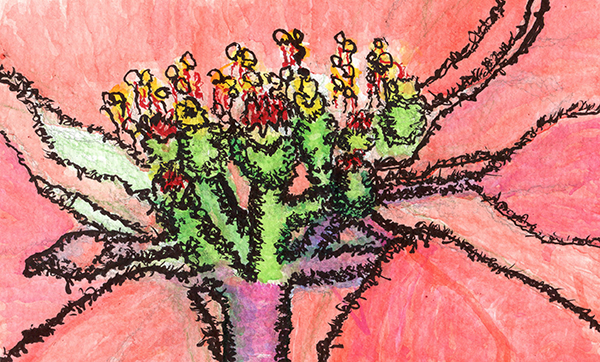
 Since I wanted to draw something seasonal, I thought of the poinsettia. Considering reference photos, I happened upon a close up of the poinsettia pistil. (I googled to find the name of that part of the flower and learned some flower anatomy.)
I also wanted to see what I can do as far as straight watercolor painting.
Creation:
Creation started happily enough. I sketched the form of the pistil and the accompanying petals and discovered that the structure was much more complicated than I originally thought. (I started sketching in watercolor pencil and switched to regular number 2 when I discovered that I had trouble seeing the watercolor pencil mark.)
The first painting session went well, I thought. I was happy with the red from my watercolor tray and mixed it with a little bit of scarlet to get some gradients. I roughed in the stems with the greens from the tray and some scarlet and blue in the bottom portion of the stem.
The next day I came back and discovered that the colors were frosted… Almost as if a layer of fine salt cover them. I painted over much of the surface, hoping to deepen the painting.
The next day I discovered that the over painting hadn’t worked. I tried to paint the bulbous forms of an ovary and grabbed an unfortunate green (very pthalo-ish) that I couldn’t soften, no matter what I did. Trying to add bits of that color elsewhere didn’t help. That’s when I decided to add marker/ink.
I’m not thrilled with the way the inking went. I like some of the marks in the upper left, where I didn’t add lines first, but I added those later and had already drawn lines on the right side.
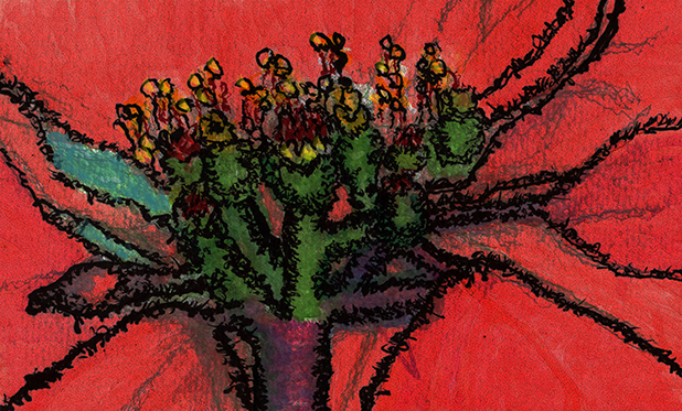
At that point I was “finished” (image above) but I wasn’t happy with the light coral of the petals. I scanned it, brought it into Photoshop and adjusted the contrast twice. Then I added yellow to the anthers. (Low-res image here)
Harrumph.
Insights:
- I have a few theories about the “frosting.” Perhaps it’s due to low quality paint. It could also be that the acrylic brushes I used roughed up to the surface, bringing the white of the paper forward. I thought I was learning quite a bit about watercolor as I painted and was happy with how things were going until I came back the next day. Possible solution: better quality watercolor paints and brushes.
- Better quality paints might also enable me to paint deeper colors, although I need to bear in mind that this is watercolor and therefore lighter than acrylics.
- When inking, don’t add lines, just scumble.
How can I connect this metaphorically?
- Enjoy the journey; don’t worry about the destination. (Process, not product.)
- Loving myself means high quality, sometimes him.
- Often, I think surety is important. In fact, hesitancy can be more attractive.
- It’s hard to see what difficult times bring us until later. (It’s not later yet.)