
Inspiration
I was thinking about autumn and simple things in it for which I am grateful. Our window looks out on a maple tree, which often blesses us with beautiful color in the fall. I started searching online for photos of maple leaves in autumn and found this photo:
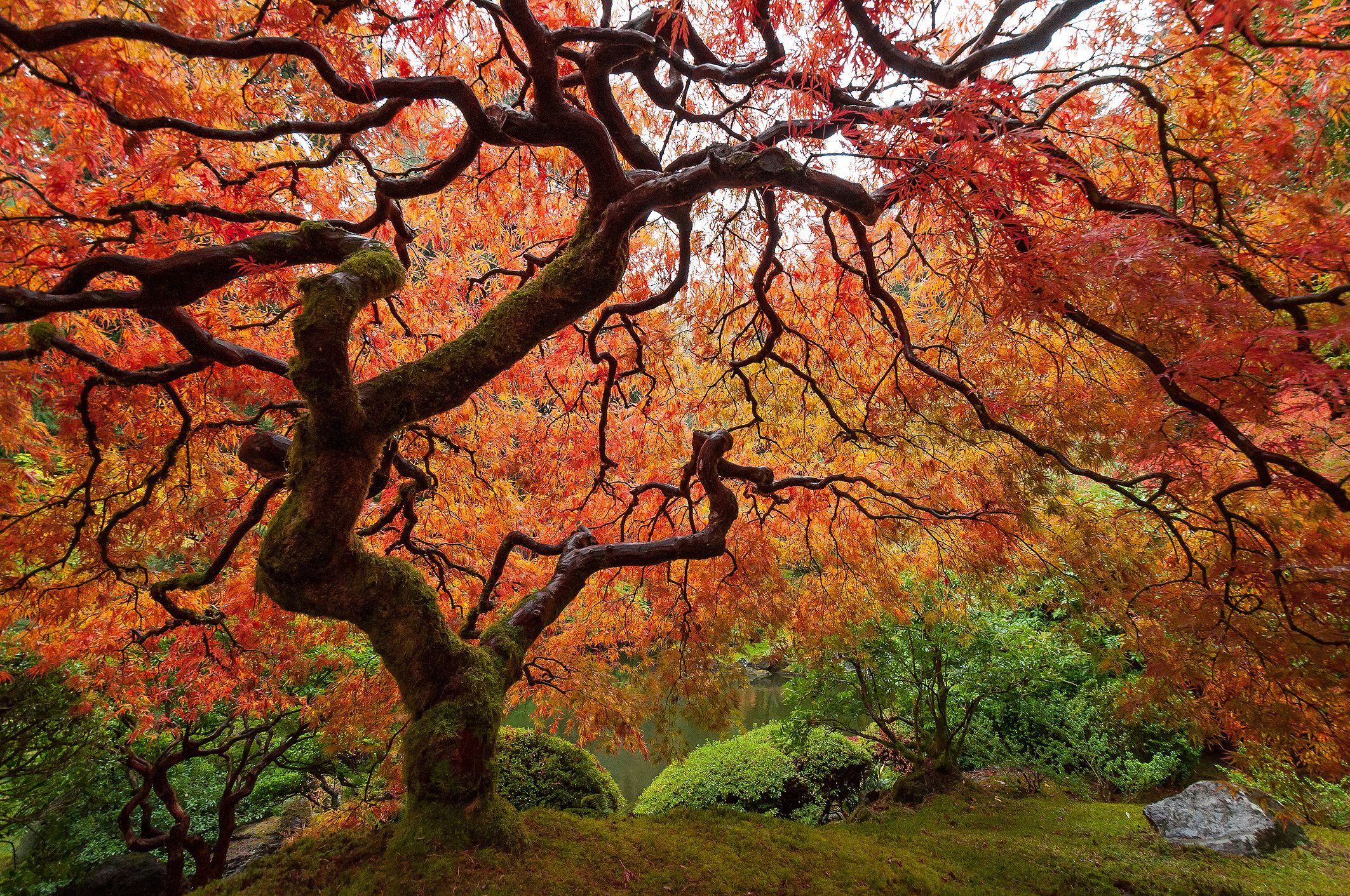
How could I resist those beautiful branches?! Can I represent the roundness of the form? I love the way the ground falls away behind the tree. Can I capture that? Notice the way the moss grows on some branches. What about that? This image fascinates and challenges me.
It’s a part of the page about identifying species of maples. This is a Japanese Maple (Acer palmatum). It’s not native to my neck of the woods and that gave me momentary pause. Still, I am a citizen of the earth and so is it. I’m looking forward to spending time with this image.
describes growing a Japanese Maple in Minnesota, tucking it in carefully every winter and expecting die back every spring. That has metaphorical resonance!
After some thought, I realized I should understand what a Japanese Maple leaf looks like. It has seven lobes.
Creation
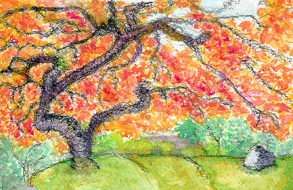
First, I sketched the tree in pencil. The somewhat squiggly line of the branches works well with my shakiness. Several times while I was drawing, the pencil tip broke and I had to get help with sharpening it. I stopped before I was quite done because the pencil was down to almost nothing.
Good news: a friend told me about a waterproof pen to try and I’ve ordered some. The Pigma Micron. I’m hoping I can use it more happily with watercolor (because it won’t smear.)
The pens came and I began inking the branches of the tree and bushes and the edges of the trunk and the hill on which the tree stands. The pen was finer than I expected. (One of the problems with ordering online is that I have trouble with sizes. It’s so much easier to see thin in person!)
I painted the distance first – the blue sky and green background foliage. I had done one layer of color across the whole painting and thought maybe I was done.
Miracle of miracles, my new morning PCA is an artist! In addition to her own work (lovely watercolor landscapes and charcoal portraits), she has worked teaching art to disadvantaged youth. She coached me through the last stages of this painting. (Truth to tell, she probably doesn’t think it’s finished yet, but I have a newsletter to send so I have declared it done.) Through her tutelage, I added more red into the orange leaves and spent more time sculpting the foreground. Because I worked on the painting longer, I added more layers of paint and the colors became brighter.
Insights:

- I love having a teacher in the house! She informs and challenges me.
- Yay for these pens!
- Because I was surprised with the weight of the pens, I ordered some with a larger nib size. I haven’t used them yet and, when I look at the scumbley marks close up, I really like them. I may lose some of that with the larger size. We’ll find out.
- Things I would do differently: I made an error in the original drawing of the bushes, which meant it was hard to fit in the water in the distance. I want to get better at drawing what I see! I think maybe I added too much red, in the end. I wonder about layering more orange over the purple to make the trunk grayer.
What do you think?
Oh, how beautiful! I love the shape, texture, and dimension of the branches, and the vibrant colors!
Thanks, Lee. I am slowly learning that the patience of multiple layers create vibrancy in watercolor. Art is always teaching me!