
image reference
https://www.thecanadianencyclopedia.ca/en/article/moose
inspiration:
Searching for a painting subject and wanting to keep things closer to home, I went to the Rare Species Guide at the Minnesota DNR. The moose is the only four-footed animal listed.
I happened upon this lovely quote which partly explains why painting is so good for my well-being.
The moment one gives close attention to anything, even a blade of grass, it becomes a mysterious, awesome, indescribably magnificent world in itself.
Henry Miller
creation:
2/12 – I am two painting sessions in at this point and still struggling a bit with layout. It took three tries to get going because I felt I didn’t have things right with basic moose head and antlers. Yesterday, I began work by watering down the antler area and removing most of the marks there. (They don’t really go away, they just fade.) By the end of the session, I started to have hope, but I think the antlers are still too small. I don’t know what the watering will do to the paper’s ability to absorb the paint.
Today, I went to YouTube and found this video.
six minutes in, she advises viewers to take this oath:
I promise to be kind to myself.
I promise not to compare my work.
I promise to have fun.
What a great way to start a painting session!
Immediately breaking my oath, I wish I could spend one 45 minute session and have a finished painting! However, her comments about having difficulty getting the moose to look like a moose were comforting. Since she is teaching, she’s already painted the painting and is doing it again to demonstrate.
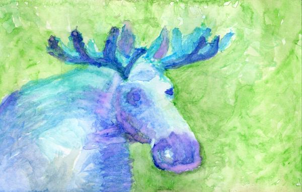
2/25 – two more sessions and I finished. Looking back on my earlier notes, I’m surprised that (a) I never mentioned that I decided to paint the moose blue, and (b) I was in so much turmoil.
The removal and repainting doesn’t seem to have done too much damage.
- it bugs me that the eyes seem to be two different sizes. (It’s always the eyes that bug me, probably it’s because they are the windows do list soul.
- I wish the shading on the nose didn’t end so abruptly. Ditto the marks on the chest.
- I meant the background to be woodsy (though the reference photo shows grass.) Instead, I think it is over painted and doesn’t show much depth.
- I’m happy about: the brushstrokes being visible. It suggests a new style. It still communicates volume, but doesn’t pretend to be anything but a painting.
- I like the color choices.
insights:
- I want to try the same technique of starting with loose brushstrokes next time, but stop earlier so it’s less overworked.
- I am so happy to be a creator! It is an important part of my mental health and overall well-being. Painting natural subjects doubles the power and pleasure of it.